Good interface design is the key to good interactive multimedia, it will captivate the user and guide their eyes and interaction the way the designer intended.
The very first thing the end user sees of your multimedia presentation is the interface design. This visual is their first impression, which, as we all know, first impressions are usually the ones that last the longest. Your Interface is your opportunity to interact with and impress the user. Therefore you need to make your interface design;
No matter how clever or ingenious your CD-ROM or website may be, if the interface design doesn’t work for the user, they may become annoyed or impatient with it and give up on your program, before they get a chance to see the real benefits of it.
Design is a very powerful and influential part of media.
It can;
Research has found that people absorb and retain more from visuals; (pictures, diagrams, etc.) than other information sources such as text and sound.
Herein lies the importance of the visual design of a multimedia presentation, for it is what the participants will notice the most.
Good design isn’t simply throwing things together.
The artist or designer is only able to create good designs once they have grasped the basic principles and elements of art and design.
It’s a little like learning to fly a plane; you need to learn how to take off, fly straight and land before you can start doing loops twirls and sky writing.
Here we also observe, that, in the multimedia field, design takes on a new aspect in the fact that the user is required to interact and respond to the interface and visa-versa, the interface is required to respond to the users interaction.
So; the initial interface has to be;
Then consecutive interfaces need to be consistent with the first and with each other, without being boring and the navigation should be self-explanatory.
In this issue we will be looking at the basic
Principles and Elements of Art and Design.
We will break design up into its pieces and look at what makes good design work, why and what doesn’t work.
Before we start.
Now that we’ve established the importance of design, there are a few preliminary steps to take before we even turn on a computer. They are:
The first part of the process is to sit down in a meeting with your client to discuss their needs and objectives. This is known as a client brief.
Take note that in most large companies, the Designers themselves wouldn’t conduct the client brief but it would more likely be the Sales or Project Manager. They would then convey the results of the meeting to you the designer. From the client brief you need to find out as much as possible about:
Here, you need to tap in, as far as possible to the clients vision of how the end product should look, sound and feel. They may not have any idea of what they want, in which case you would be required to use your own expertise to come up with ideas and design concepts.
Determining your goals.
There are many things to take into consideration when designing a presentation and it is best to plan well before you start, so that you can get a good idea of what sort of look and feel you want to use in your project. To do this you need to identify your goals, which means asking yourself (and your client) the following questions:
Let’s have a brief look at these;
1) What is the message?2) Who is the end user?
It is important to know, as best you can, who your targeted audience is so that you can fashion your presentation to suit their tastes.
Matters to take into consideration may be;
3) What is the desired outcome?
Defining the outcome is important in establishing the direction and style of your work.
To do this you need to ask:
Ideas and Preliminary Sketches.
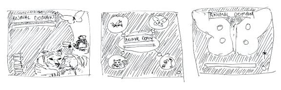
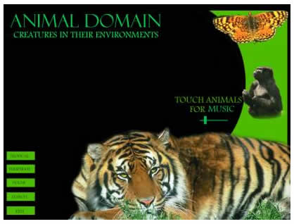
After you have gathered as much information as you can it’s off to the drawing board to begin preliminary sketches. This is done as a series of “thumbnail sketches” or “roughs” of the screens, in a similar fashion to the storyboarding style that filmmakers use. It is best to try at least 3 or 4 different design ideas before doing more detailed sketches of the designs they liked most or blends of the best few. These will then be presented again to the client for approval or further discussion. (Good designers will do 6 to 10 thumbnails to show the client.)
These first presentation sketches need to be clear and descriptive but not overdone. They are only rough sketches for conveying a concept or notion.
Ready to get started?
Once you have finished with the client briefs, determined your goals and your preliminary sketches have been approved, you are ready to gather all the available assets, (logos, pictures, video, etc.) and start piecing your designs together.
Whoa there!!!
Before we go any further lets just reassess where we’re at and where we’re going.
We have so far:
Even to make it to this stage, the designer needs the knowledge of the principles and elements of art and design. These fundamentals need to be observed in the preliminary sketches for a start.
Firstly, we’ll have a look at the basic Principles of Art and Design, which are the goals we need to achieve in our design work. Then we will follow on to learn about the basic Elements of Art and Design which are the visual means in which to obtain the Principles of good design.
The Three Basic Principals of Design.
Although Design is a very complex field there are three basic sets of guidelines or Principals that always apply to good design.
They are
Lets take a brief look at what these terms mean:
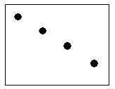
Unity.
Unity is probably the most important principle of art and design.
Unity is the organization of the elements in which to direct the users' eyes through the design and to enable them to view it clearly as a whole.
Unity is the way the elements and objects of the design relate to one and other or how they belong to the picture as a whole.
Questions of unity are:
If the unity is not good the viewer may; miss certain elements, not get the whole picture or lose interest.
All of the elements of design (Colour, value, shape, texture, line, form and space) can be used to contribute to the unity.
For example; if a block of text is aligned to a particular picture or grouped with it in some way it amounts to a unity between the two. However if it is not aligned, grouped, colour coded or otherwise coherent with the other we would find it hard to understand whether the text has any relationship with the picture or not.
If there are pieces of text and/or other objects you need to ask the following questions of Unity:
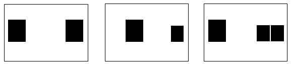
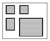
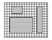
Have a look at the following diagrams.
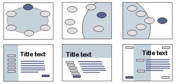
It should be apparent which of the screens above lacks unity. Take note though, that they all have a certain degree of unity, due, simply to the similarity in shapes within the layout.
As the word, unity, suggests, this principle is about uniting the objects of the layout, which often depends on how we position them in relation to each other. It also depends on relationships in shape, colour, line, texture, etc. (We will look deeper into this later on in the module)
The following exercises are designed to help give you a sense of unity simply by positioning objects in relation to each other.
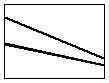
Balance.
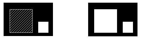
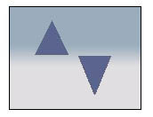
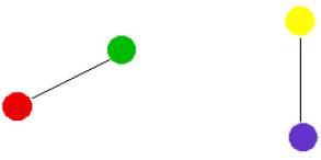
Balance is the way the elements of the design are distributed in which to keep things from looking lopsided and to help maintain unity. A simple model for visualizing or testing the balance of a design is a set of scales.
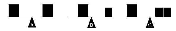
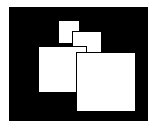
You will notice, in the diagram above, that all three examples seem relatively balanced.
In example A, the two blocks are of equal size or weight and therefore balance at an equal distance from the centre.
Now in example B the block on the right is much smaller or lighter than the other and so therefore the larger block needs to be closer to the centre so as to not outweigh or overbalance the small one.
And in example C the two smaller blocks on the right balance out the other.
The next diagram shows the same three examples of how balance works within a screen layout.
There are 2 types of Horizontal Balance. They are:
Formal Balance (Both sides are equal)
While formal balance is an easy and safe option, (and in many cases the appropriate option) it can (In a world of dynamic design) be a bit ordinary.
2. Informal Balance (Positioning is not symmetrical but still balanced).
The Image above is less formal in balance to the one previous, which makes for a more dynamic and interesting impression.
Other factors, beside size, also determine the “weight” of an object, like colour intensity, brightness, contrast and transparency.
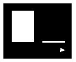
In the first example here you may observe that although the object on the left is much larger than the one on the right, it still seems to be balanced out by the solid block.
In the second diagram, the larger block outweighs and dominates the smaller one.
Balance in design is not only on a Horizontal basis. It also works on a Vertical and Radial basis as well.
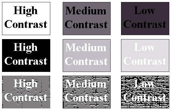
Contrast is the level of visibility or clarity of an object with respect to its surroundings.
For example, Most traffic signs are bright yellow, because this colour really stands out (or has a high contrast) from most other colours. Also the message or symbol on these signs is black, because black has a high contrast with yellow.
Contrast is the distinction between objects and elements, within the design layout.
Varying contrasts are mostly used to:
Contrast is particularly important where text is involved.
Text needs a certain degree of contrast to be legible. Have you ever seen a foreign movie with subtitles where the words are too difficult to read because there was too much activity and not enough contrast between the text and the background? Especially, for example, when the text is white and the character speaking is wearing white shirt.
You may have noticed that more recent subtitled movies put a 50% transparent black banner behind the text to create a contrast and therefore making it more legible.
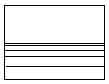
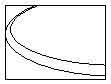
The following diagram is a visual definition of contrast levels and also demonstrates how different levels of contrast affect the legibility of text.
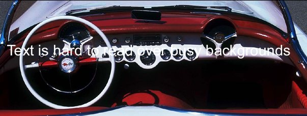
The background and other supporting elements should not interfere with the main content or be distracting the user from it. Yet, we still want the background and supporting images to be interesting and exciting. The key here is to find a balance between style and purpose.
The following image is a good example of how busy backgrounds can make text hard to read.
There are many ways to overcome this problem. One of the most common ways is to position a panel behind the text. In the following image I’ve put in a black panel and made it 50% transparent to make it less obvious.
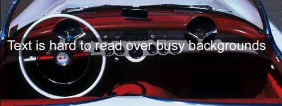
A soft edge on the panel would make it even less obvious.
Effectively, what I have done here is decreased the contrast of the background to allow more contrast to the text.
Contrast highlights the desired objects or focal points. Contrast helps to make your layout interesting and is a great tool for attracting the users’ eye to the desired targets.
Contrast is obtained using;
The three principles: Unity, Balance and Contrast are intertwined. They all support, conflict and have effect on each other.
Now the next question: How else do we obtain these principles?
So far we have only used location of objects within the layout to achieve Unity and balance and we have observed the importance of Contrast.
Well, we use a set of visual tools called the “Elements” of Art and Design.
In the following pages we will have a look at what these elements are and how they contribute to the Unity, Balance and Contrast of the design.
The Basic Elements of Design.
The elements are the nuts and bolts of design. They are the ingredients we use to achieve the principles. (Unity, balance and contrast.) Elements are made up of the bits and pieces that we put into our designs. (Pictures, text, diagrams, backgrounds, panels etc.)
There are seven basic elements of design, they are:
Elements of design are the visual characteristics you would use to describe a layout. If, for example, you were asked to describe a particular building, you would describe it in terms of shape, colour, line, texture etc. (Tall, Yellow, rounded corners with smooth walls etc.)
Elements are the physical aspects that the objects in the layout form and have different influences on each other and the design as a whole.
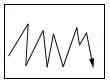
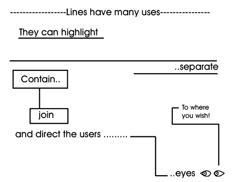
Line.
A real or imaginary line is a vital element of visual communication.
Our eyes are conditioned to follow and be guided by the lines within a layout. In everyday life we are continually confronted with lines that guide us through the day. (Roads, paths, fences, arrows, etc.)
A point is a single position that has no width, height or depth. Two points suggest a line, which not only has width and height it can also suggest depth in the 3rd dimension.
Line may be:
An actual stream of colour,
The imaginary path, or flow of space between two or more points or objects,
The alignment of edges and boundaries of objects,
The boundary the eye draws between two textures colours or blends in a picture.
It is ingrained into our nature to subconsciously follow and be guided by lines. (Lines on the roads, arrows etc) Line is therefore a very important element that designers take into consideration when planning how they want the viewer to:
Written words are also a form of linear communication; we know where to start and then follow the lines of letters, words and numbers until we have taken in what we want to absorb.
Lines can also express physical and emotional feelings. With the use of style position and direction designers can use line, in conjunction with other elements, to express feelings or moods. There are several ‘rules of thumb’ that designers go by in which to use line to help portray a particular ‘feel’ in their design layout.
The following is a guide to feelings that line may help expression in art and design.
Horizontal and straight: Rest and Calm.
Vertical and straight: Stability, Strength and Dignity.
Diagonal: Motion, Liveliness and Action.
Simple curve: Peaceful motion and Grace.
Angular: Agitation and Urgency.
Shape.
Shape is one of the most powerful forms of imagery in design. Think of the Nike logo, for example, it is a simple tick shape that can be recognized easily no matter what colour it is and it doesn’t need the word anymore. The Target and Mercedes logos are another example of the visual power of shapes.

Shape generally refers to the 2 dimensional areas within a design layout. Shape, like line, is defined by the outline of the objects or other elements themselves in the layout but also the shapes they form in the space around them. The shape element of a design is very closely related to line in the form of expression it can generate but more so because of the lines shapes generate.
Most developmental or windows software we know is square in shape. (Straight vertical and horizontal lines.) This is mostly because square shapes are economical on space and easy to organize (as simple as stacking boxes).
In more recent times, multimedia applications, with the use of advanced computer graphics, are becoming more organic in shape.
This means that, like organic or natural objects, the shapes are more rounded rather than straight.
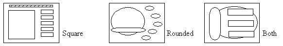
In the field of multimedia we are generally restricted to having our layout displayed within the proportions of a computer monitor. These proportions are a landscape view of 4:3 (4 units across to 3 units down, usually 640x480 pixels or 800x600 pixels). So to start off with we already have a certain shape to work with.
Form.
Form is the element that creates the illusion of depth (3D) in a design layout or even within individual objects. Other words to describe form would be volume or mass.
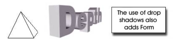
These shapes could be said to have Volumetric Form.
Form can also relate to the general arrangement of a layout, meaning that form is the harmony of the elements and of the design as a whole.
Space
Space is the area or real estate on your screen.
There are two types of space in design;
Negative space is the empty space you start off with when your screen layout is empty. When you start putting objects into the layout you are creating positive space.
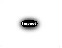
Often a large amount of negative space adds to the impact of a single or small amount of items.
It is important to think carefully how you use the space of your design so that it doesn’t become cluttered or distracting to the viewer. If you have an image as your background this would now represent negative space.
Be careful that busy background space doesn’t detract from or dominate the primary content.
The illusion of 3 dimensional space can also add to the feel of a design. Here we can see how overlapping the elements and the use of proportion to indicate distance creates the semblance of spatial depth.
Negative space, if used carefully can also be used to balance out positive space.
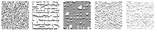
Texture.
Texture refers to the type of surface area of an element or object.
A texture could be described as:
Different textures are useful for creating different atmospheres, moods and contrasts.
For example a presentation about geology could appropriately have a rough rocklike background texture to set the mood of the area we are looking into.
Whereas a presentation for a wedding photographer might have a soft, smooth and lacy texture.
Tiled images are often used to create textured backgrounds for web sites, which can make it more interesting than plain colour. (The image is repeated in a checkerboard like pattern called tiling for quick download of a small image.)
Value. (Or Tone)
Value is the level of brightness of a design or surface. It can also be referred to as the shade or tone of a colour. Value does not designate the colour itself, it is the amount of light emitting or reflecting from the coloured surfaces. If you dim the lights in a room the colours remain the same but decrease in value or a darker shade of the same colour.
This is an important element in creating the mood or feeling of the design.
A presentation with high or bright values could be described as:
Vibrant, cheerful, playful, etc.
Whereas, one of lower or darker values would tend to be more:
Serious, polished, moody, mysterious, etc.
Colour.
The colours used in a screen design are of paramount importance. Colour is used to effect the contrast, unity, balance and mood of the whole presentation.
Balancing colour qualities throughout the design is a good way to support unity and to create a general mood.
This can also follow on through to the other screens to help create a common harmony throughout the presentation.
Colour can be used to create a mood or feel, which may support the topic and appeal to the desired audience.
This is done with the different emotional qualities of colour:
The use of contrasting colours is also a very useful method of drawing the users' eye to the primary content and elements. It is very important that secondary elements don’t dominate or distract the viewer from the intended purpose of the page.
Text must be readable and one way of achieving this is by changing the colour values of both the text and the background or panel, to opposing levels to create a contrast between the two.
Designers use colours for a variety of purposes such as:
Colours are well known for their relationship with emotions.
For example;
“He was green with envy”,
“The movie had very black humour”,
“She was so angry she saw red”, etc.
Different combinations of varying colours can also express particular moods or atmospheres.
For example;
Before we go any further, lets have a look at what colour models are and how they work.
Traditionally, the 3 primary colours are red, yellow and blue.
These are the basic colours of paint that can’t be obtained by mixing any other colours.
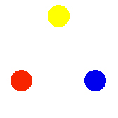
If you mix 2 primary colours you get a secondary colour. (Red + yellow = orange, yellow + blue = green and red = blue = violet)
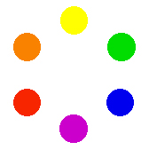
Then if you nix the colours in between you get the Tertiary colours. (Yellow-green, blue-green, blue-violet, red-violet, red-orange and yellow-orange)
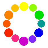
Here we see the formation of the colour wheel, which is a good guide for designers to select colour schemes.
This colour wheel is the traditional version. There are 2 other colour wheels which refer to different colours as the primary colours. They are the CMYK model, which is designed for high quality printing inks, and the other model is the RGB model, which is the additive colours used in computer screens.
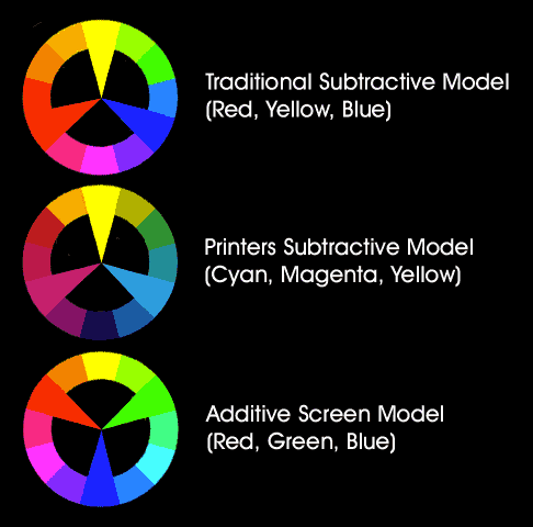
Artists, Printers and Colour theorists would argue which is the correct colour wheel to work with but in reality we are only trying to rhyme and reason into why some colours go well together and some don’t.
Colour schemes:
Colour schemes can vary from being very safe, at the risk of being dull and boring, to very bold, at the risk of over doing it and making the design hard to look at. The art here is to find the appropriate colour scheme to suit the purpose of the design.
The following are a few basic formats, which can help you to find the right set of colours for your design.
This is the safest scheme of them all, simply being different tones of the same colour.
There is no risk of a colour not “matching” with itself. These sort of colour schemes are good for say an accountant’s web site where we want the customer to feel very safe and stable.
Analogous:

Analogous colours are those that are next to each other on the colour wheel, therefore being of similar hue (colour) These sort of colour schemes are a bit more lively than the monochromatic, suggesting a little more life.
Complimentary colours:
These are the colours that are opposite each other on the colour wheel. As the name suggests, complimentary colours compliment each other. Their relationship is very dynamic and often harsh to look at for too long.
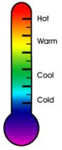
Warm or Cool:
The warm colours are situated on the left-hand side of the colour wheel and cool colours are situated on the right.
The “temperature” of a colour is very significant to the sort of feeling or emotion it represents.
Warm Colours.

As the name implies, these are the colours that express warmth or heat.
They are the;
The depicted temperature of a colour expresses feelings in the same way that we use the words of temperature to express similar feelings. (Eg: Warm hearted = love = red.)
Warm colours express warm or hot feelings:
Cool Colours.

Cool colours clearly are the opposite of warm colours.
These are the:
Cool colours express everything that is;
Colour Value.
Value is an element in its own right but it also has, for obvious reasons, a strong influence on colour and the feelings that are expressed by those colours.
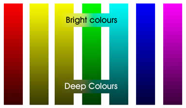
Bright Colours.
Bright colours express feelings of:
Deep Colours.
Deep colours can be:
Soft Colours.
These are the delicate and airy, the pale and pastel colours. Often used in interior design because they are;
A note of warning: Certain colours and colour combinations can mean different things in different cultures. If you are producing multimedia content that is targeting an audience of another country it pays to investigate the meanings and implications in their culture. An example of this would be that most western cultures wear black for mourning whereas some Asian cultures mourn in white.
Colour is undoubtedly the most influential of the elements. It has more impact on the mood and feeling of a design than any other element. Colour is also the most complex of all the elements. Colour schemes can be almost infinitely varied and diverse as can the choice of colours themselves. When deciding on a colour scheme for your presentation it is important to define the impact you want to it to have on the viewer and then decide what colours are best used to carry this out.
Other Screen Design Issues.
Screen Crowding.
There is often a tendency, for the designer, to want to fit everything onto one page. There is a famous quote about blues music by John Lee Hooker, which is “Less is more”. The same applies to graphic and multimedia screen design.
Don’t ask the question; ‘what else can I fit in?’ But ask ‘what can I leave out?’
Overcrowding of a screen can be very distracting and often diminishes the potency of individual items and also the screen design as a whole.
Screen crowding is also an issue for web pages because too many images will slow down the downloading speed.
Scrolling and Pagination.
Web page designers often use scrolling text on pages where too large amount of text to display at once on the screen is required.
For web pages, scrolling is almost always a better option than pagination because the latter would mean downloading a new page each time a page is turned.
For CD-ROMs and other multimedia presentations, however, the real world metaphor of turning a page (Pagination) is often regarded as the more tasteful option. This way you, the author, can have more control over which pieces of text can be seen at once.
This way also gives the designer more flexibility to layout the text more stylistically in relation to the rest of the screen.
Attention getting Devices.
Animated gifs, flashing lights, noises and rollover actions are all great devices for getting the users attention, but beware, watch that they don’t draw the users' eye away from the intended content rather than to it. These gimmicks can be similar to red light specials in department stores, yes, they certainly grab your attention but they can also be quite annoying or trashy. This also depends on the type of presentation you are developing. In some cases, like children’s’ CD-ROMs, these devices can be a lot of fun.
Windows.
Pop up windows and dialogue boxes can be very handy when the viewer is expected to return to where they were previously. This helps prevent the user getting confused or lost in the navigation. When the user is finished with the window, they click OK or Done, it disappears and they return to where they were in the background, which was never out of sight.
Screen Resolution.
For multimedia presentations we are always restricted to the shape and size of the monitor which is a rectangle with a width to height ratio of 3:4. The standard minimum size is 640 pixels by 480 pixels although most computers these days have a screen resolution of at least 800x600 pixels. For web page design you also need to take into account the restriction of the viewable area of the web browser.
Web browser viewable areas for maximized browsers are as follows:
Screen Resolution: |
Viewable Area: |
640x480 |
600x300 |
800x600 |
760x420 |
1024x768 |
955x600 |
(These figures can vary depending on how different users set up their browsers)
You need to make sure your design work effectively for all of these screen sizes, which means optimizing the design to for the smallest screen resolution you estimate most of your target audience use.
Type Styles and Sizes.
Type is a vital part of and is present on just about every interface design. Text is an obvious and integral tool of communication. There are many type styles and sizes to choose from but there are several factors that need to be taken into consideration when using text.
They are:
1) Legibility.
It can be very frustrating for the user when text is hard to read, because;
The usual size for text to be easily read on an average size monitor (14-15 inch) is at least 12 points and up to 18 points for body text and larger sizes for headings etc.
The colour of the text needs to be of a contrasting colour to that of the panel or background behind it, otherwise the eye has trouble identifying the letters because of too much colour similarity.
It pays to consider that the user may not have as good vision as you do or as good a monitor.
2) Fonts.
There are hundreds of fonts to choose from but there are several issues to take into consideration when choosing a font.
Firstly, you need to ask the question:
‘Will the users have this font installed on their computers?’.
If you enter your type using an authoring package and the user of your CD-ROM or web page doesn’t have the particular font installed it may come out as gobbledegoop or illegible shapes.
There are several fonts which are installed by default with Windows and Macintosh operating systems such as Times New Roman and Arial.
If you choose to use an uncommon font, you can, in the case of CD-ROMs, set it up to install the font onto the users computer, but this may be seen as an inconvenience to the user and also there may be a copyright issue involved with the particular font and royalties to be paid.
In the case of web pages, you can set up the Html in such a way that if the users computer doesn’t have a particular font then it will choose the next best option.
Another option is to type the text into the image in Photoshop, xRes or a similar program, and then the fonts are not needed to be installed on the users machine.
A font is either serif or sans-serif.
A serif is the T shape on the ends of the lines of the letters. Sans is the French word for “without”.
Serif fonts are generally considered to be more readable for large blocks of text, because there are fewer similarities between the letters, the accent of the serifs themselves makes the letter strokes more recognizable and they help the eye see the word as a whole.
Sans-serif fonts have clean straight lines and geometric appearance. They are considered to be good for headings, captions, lists, charts and short phrases, especially where space is limited.
There are five basic font types or families;
Fonts, like other elements can be used to convey a particular feel for your project. Therefore it is wise to consider the personality of the fonts to suit your presentation when developing your style guide.
Most presentations only need one or two fonts. Sometimes maybe three, but any more will generally cause a lack of consistency and clash.
3) Style.
Most programs that deal with text have the following selection of styles you can impose on your text for different effects, such as: Normal,
Bold,
Italic,
Underline,
Strikethrough,
Reverse.
Most text should be normal unless it is made bold to make it more readable over a textured background.
Bold and italic text should be kept to a minimum; otherwise it looses its potency. However they both tend to be more effective than underlines which on the web tend to indicate a link.
USING ALL CAPITALS CAN BE HARD TO READ, A BIT BORING AND ULTIMATELY OBNOXIOUS - IN FACT WEB ETIQUETTE REGARDS IT AS SHOUTING!!! So unless it’s an EMERGENCY, a HEADING or VERY IMPORTANT........Keep it down!
I think Strikethrough is for pointing out a mistake? This is one enthrawlin enthror grate adventure written by an intelligent intelly untooly brainy dude.
4)layout.
There are a few basic standards for what type of layout designers’ use for specific purposes.
The alignment applies to how of a body of text lines up in a column. The following is a basic guide to which alignment to use for what purpose.
Pieces of text should be proportionately balanced, in size and value, with respect to level of importance, to other elements and objects.